A look into five principles of User Experience (UX) Design that guide SIS' UX Team and support SIS Complete's ease of use.
At SIS, the User Experience (UX) of our solutions is a top priority. Improving the quality of our users’ interactions with their products and services goes hand in hand with our approach of delivering a smarter, more tech-enabled software product.
What is User Experience?
User Experience (UX) Design is the process of increasing a user’s level of satisfaction with a product or service and focuses on everything from how well the user can navigate the product and how easy it is to use to how relevant the content displayed is. Good user experience is dependent on the UX designers having a deep understanding of the end users’ needs, values, abilities, and even their limitations.
UX at SIS
Our team of UX specialists are passionate about design and always stay focused on the needs of our users. Evolving our existing designs and creating future concepts for new features are the main focus of their work and while there are many UX principles that guide our team, these five considerations are foundational to their work each and every day.
1. Confidence Is Essential
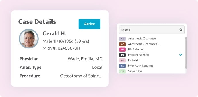
Earning and keeping the user’s confidence is critical, especially when health data and protected health information (PHI) are involved. In the simplest terms, users need to have confidence in their use of and proficiency with the solution, and an intuitive, easy-to-use UX is a key component of achieving this.
Another way that confidence is earned is by ensuring a consistent set of behaviors and visuals across different modules. As users learn an application, they are essentially learning a visual language. They must be able to depend on that language to consistently help them accomplish their tasks efficiently.
Providing the ability to review, edit, and undo work at every step is another important way to build trust. Users should never feel ‘stuck’ or unsure how to proceed.
2. What You Expect to See Is What You Get
Users also need to trust that the application will behave in expected ways. One way we achieve this is by paying close attention to affordances, or the implicit understanding of how to interact with an object. A classic example of an affordance in the ‘real’ world is a handle on a door to suggest that it should be pulled, versus a flat metal plate to suggest that it should be pushed.
In UX, affordances are the visual attributes of objects that communicate their intended use. Tabs, for instance, suggest there is additional content hidden from view. Buttons suggest an action can be performed. As an application matures, it develops its own library of affordances that the user becomes quite familiar with.
Just as importantly, objects that do not perform actions should not look like they do. This is called a false affordance, and it can lead to confusion and frustration. A handle on a wall is useless!
3. Design Is Never Done
Our design concepts usually begin as rough sketches and mature through our product development process until they become fully functional code. Even then, our design process is never done.
Our clients have a key role in the UX of our ASC solutions. If something isn’t working for our users once it’s live, we listen to those concerns and go back to the drawing board. One of the most interesting areas of work for our UX team is to translate that client feedback into a constantly evolving user experience, informed by workflows that match real-world scenarios. Multiple iterations and active listening to clients’ needs ensure the best possible user experience.
4. Aesthetics Matter
‘Form follows function’ is a common saying in design. It suggests that how something functions and behaves is always more important than how it looks. Maximizing ease of use is always our main goal, but aesthetics matter, too.
A clean layout that’s pleasing to the eye, with evenly spaced elements in consistent locations, is more than just pretty. It helps users find their way and complete their tasks more efficiently.
At SIS, we believe that form and function go hand in hand.
5. Simpler Is Better Until It’s Not
Complex tasks often require complex user interfaces. Completing clinical documentation and managing financials are just two examples of the inherently complex tasks that our users accomplish every day with our solutions.
Tesler’s Law states that every system contains a certain amount of complexity which cannot be reduced any further. User interfaces can only be simplified so much before they no longer meet the needs of their users. Our UX team’s goal is to design our products in a way that lifts as much of the burden of that complexity off the users’ shoulders as we can, while still providing the means to accomplish all the required tasks.
SIS Complete: Smarter Form, Smarter Function
Built by expert design and development teams with the unique needs of ASCs in mind, SIS Complete, SIS’ suite of cloud-based solutions, boasts an intuitive and modern interface that is easy to navigate and understand, even for new users. SIS has received the Black Book™ Top ASC Technology and Best in KLAS: ASC Software designation for the last eight and two years, respectively, with client feedback ranking our ease of use above the competition’s.
Offering industry-leading technology with an emphasis on usability, SIS brings ASCs a smarter, more tech-enabled approach to every aspect of managing surgery centers, from EHR to case costing. Discover how SIS can help your surgery center Operate Smart™.


